Comments & Conversations

2025
www.washingtonpost.com
Project Overview
Role: Staff Product Designer, Lead
Team: Conversations (Community Product)
Timeline: 2024-2025
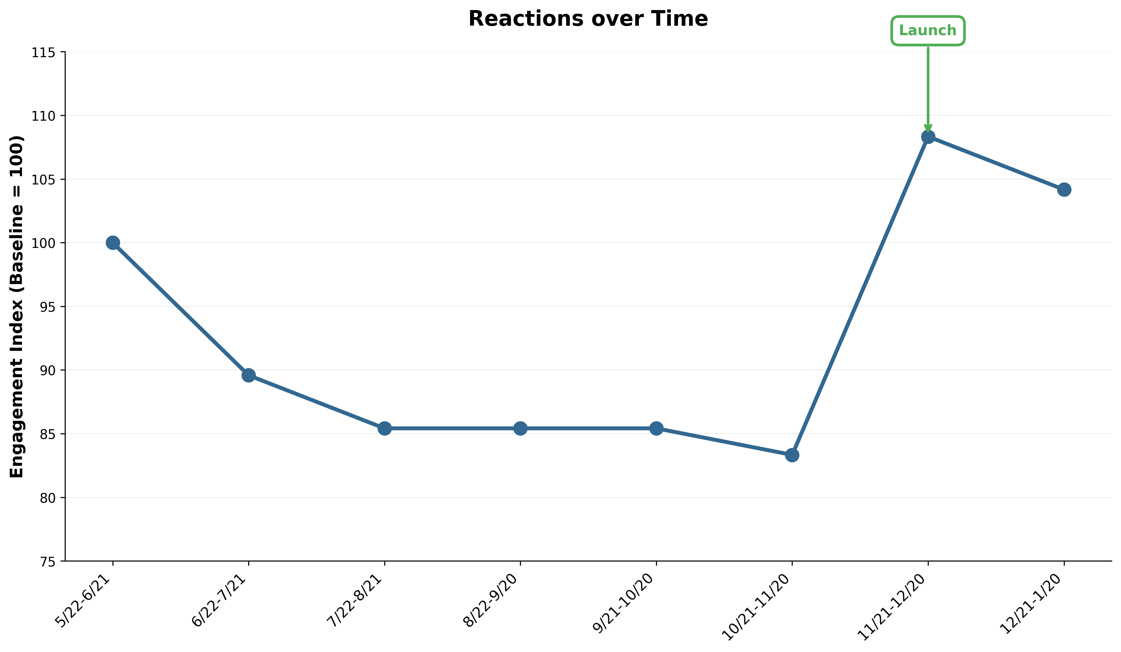
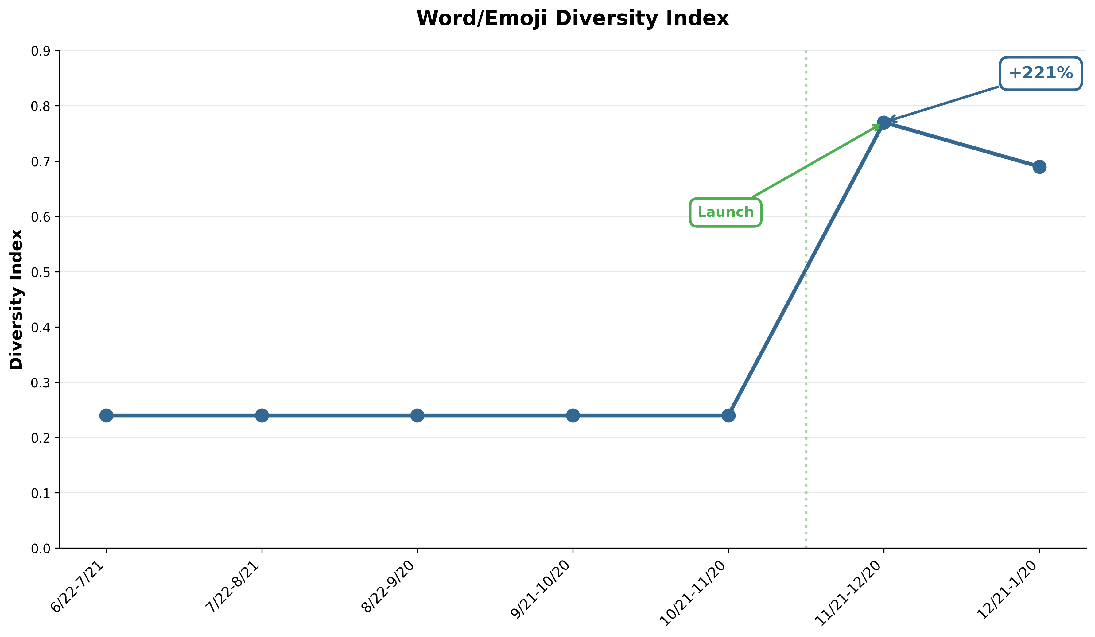
Impact: Marked improvements in user engagement with reactions and voting (Q4 2025 analysis)
The Challenge
I joined the Conversations team mid-stream while they were reworking The Post's commenting experience. The product faced several critical issues:
Scattered design direction across multiple touchpoints with no cohesive vision
Inconsistent patterns between comment threads, reactions, and discovery features
Unclear strategy for improving user sentiment and engagement
Designers working in silos without agency to provide their best value
The team needed strategic direction to unify their work and a mentor to help designers understand how their individual contributions fit into the larger vision.
My Approach
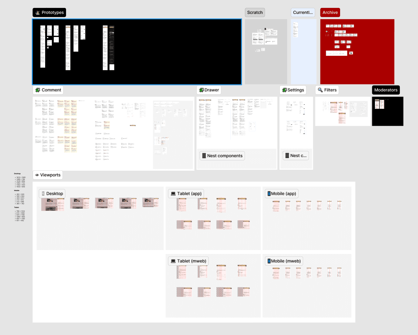
Rapid Orientation & Strategic Assessment
I quickly oriented to existing work by reviewing past designs, understanding technical constraints, and meeting with stakeholders across Product, Editorial, and Engineering. Rather than accepting previous decisions as fixed, I thoughtfully questioned the rationale behind them to understand what was working and what needed to change.
Within weeks, I identified key opportunities:
Reactions lacked visual appeal and clear feedback
Comment discovery prioritized recency over quality
Filtering systems were functional but not intuitive
Design patterns didn't connect across the broader conversation ecosystem
Defining Vision & Strategy
I worked closely with PM Noa Yadidi to establish a clear strategy for the next phase of development. This included:
Prioritizing engagement mechanics that rewarded quality contributions
Creating visual language that felt native to The Post's brand
Establishing a hierarchy that surfaced valuable comments without burying diverse voices
Connecting disparate features into a coherent conversation experience
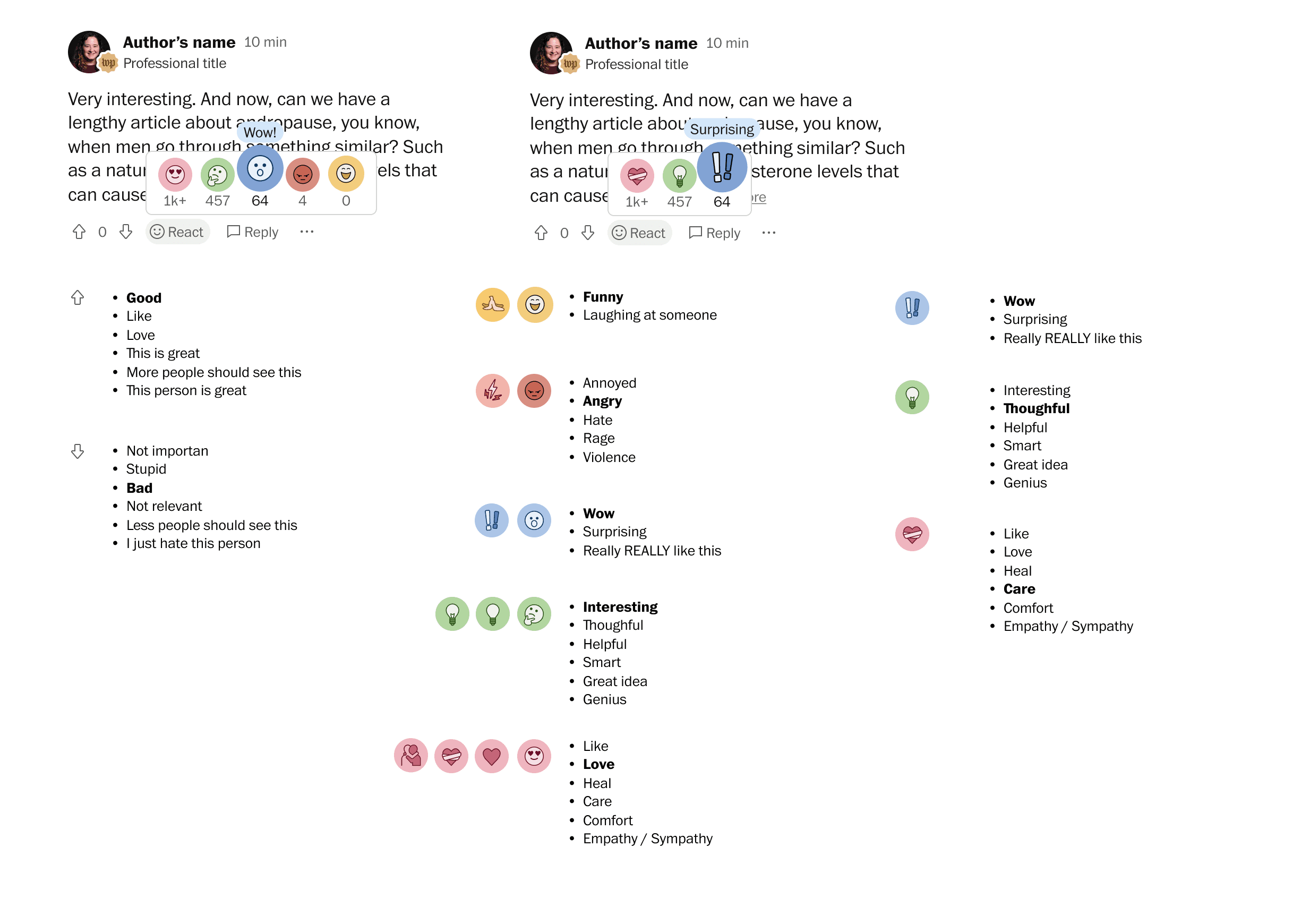
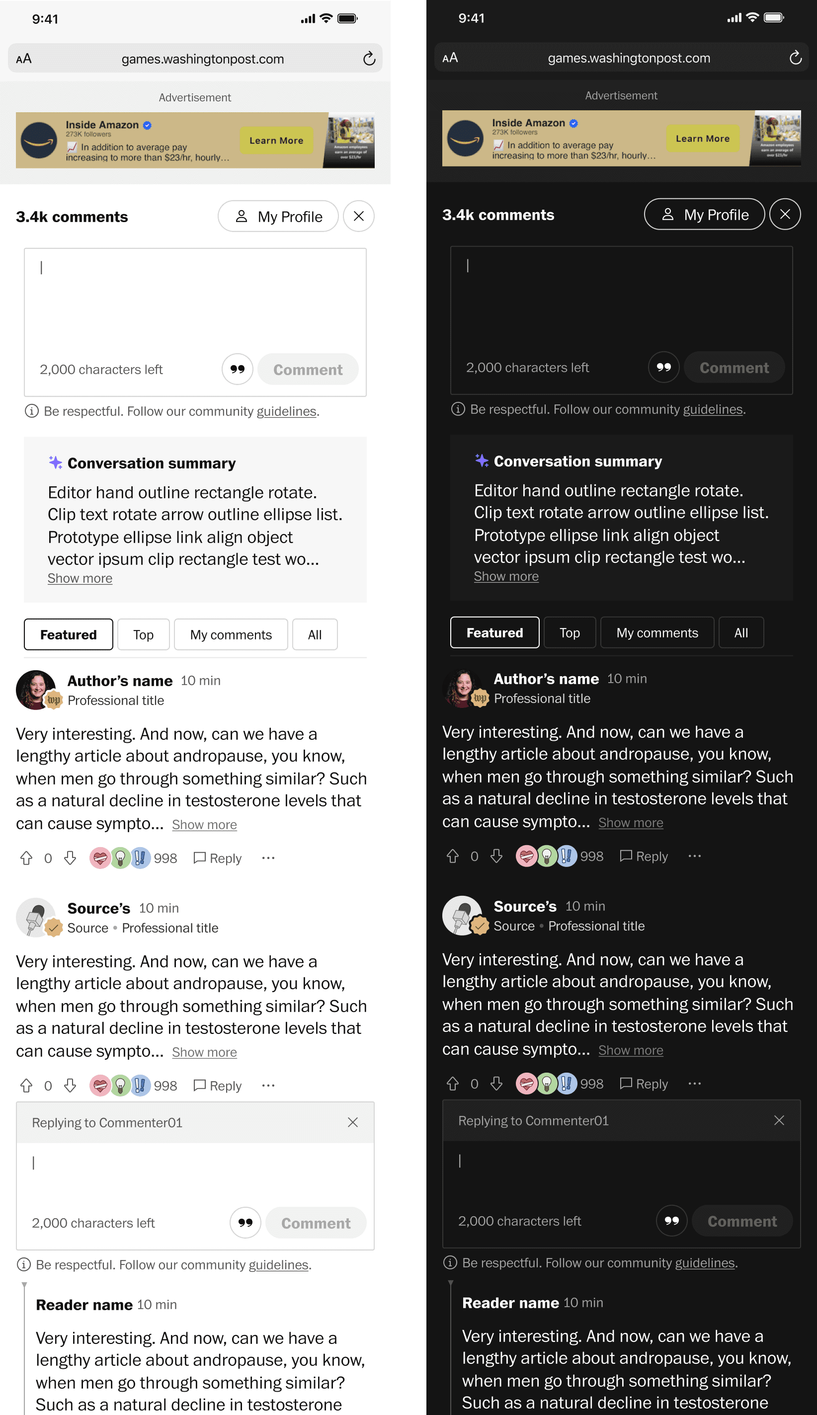
Designing Animated Emoji Reactions
I designed and art-directed animated emoji reactions, working closely with the news design team to ensure they felt distinctly "Post" rather than generic. The animations needed to:
Provide immediate, delightful feedback when users reacted
Feel sophisticated and news-appropriate (not social media casual)
Work at scale across article types and contexts
Encourage engagement without feeling frivolous
 |  |  |  |  |
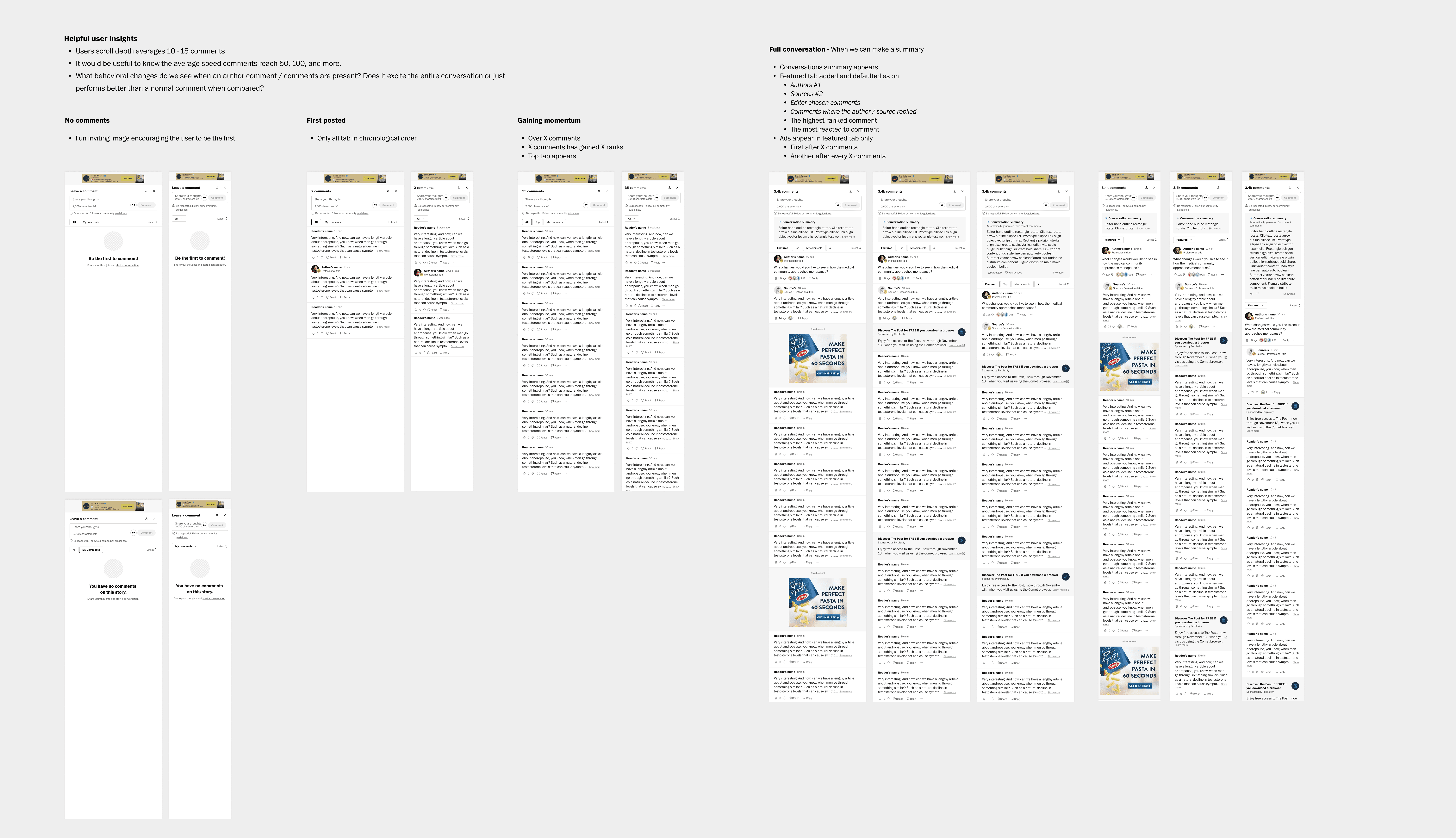
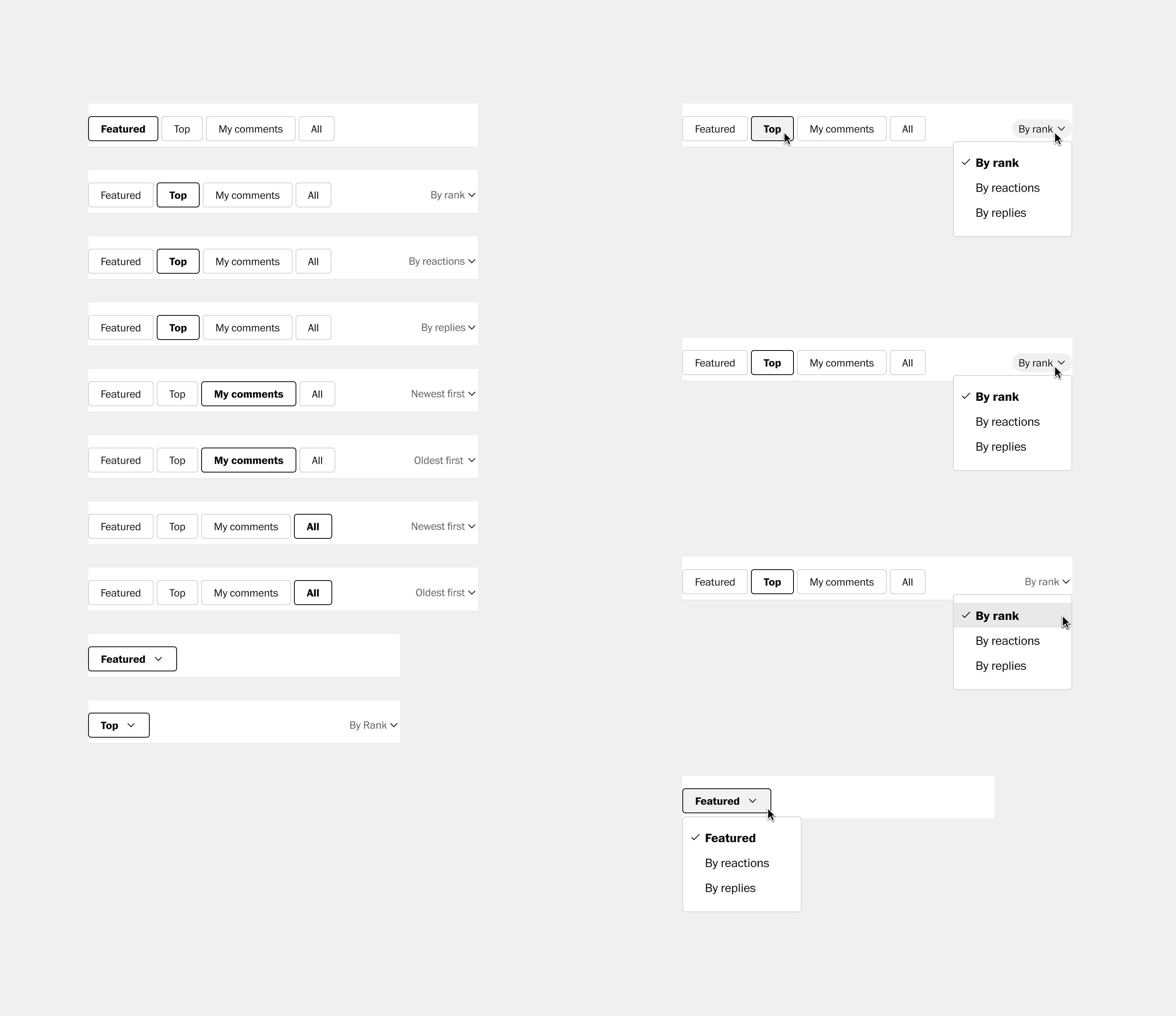
Refining Filtering & Discovery
I redesigned filtering experiences to make them more intuitive and powerful:
Simplified filter controls while maintaining flexibility
Added visual previews of filter results before applying
Created persistent filter states that users could save
Designed empty states that encouraged engagement rather than feeling dead
Mentoring & Unifying Design Work
Beyond my direct contributions, I mentored both junior and senior designers on the team, helping them:
Connect their individual work to the broader conversation vision
Understand how commenting patterns should inform related community features
Make decisions that scaled beyond immediate requirements
Think systematically about user needs across the conversation lifecycle
I introduced new perspectives by questioning assumptions and bringing patterns from other Post products, helping the team see their work in the larger context of The Post's user experience.
The Outcome
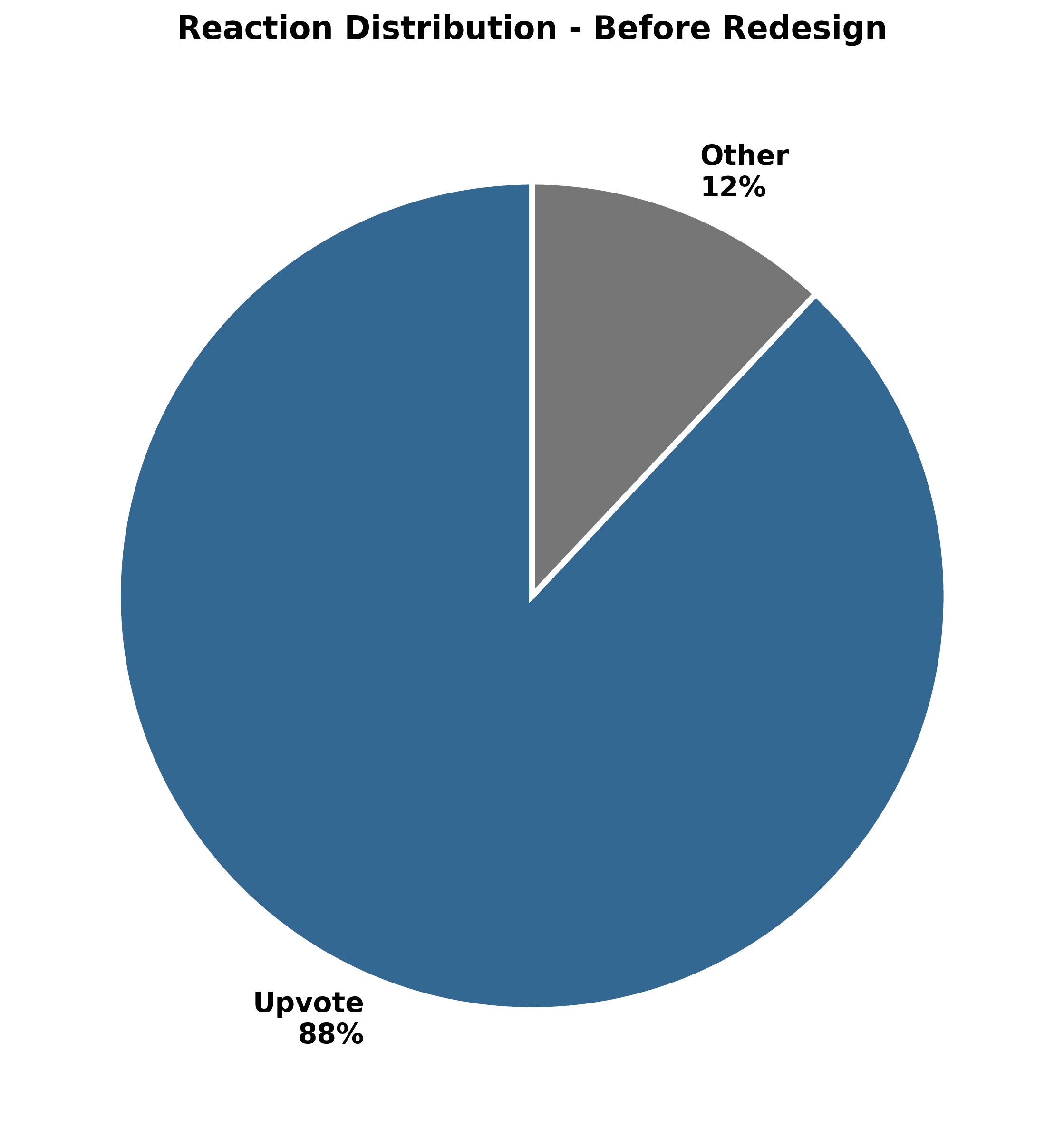
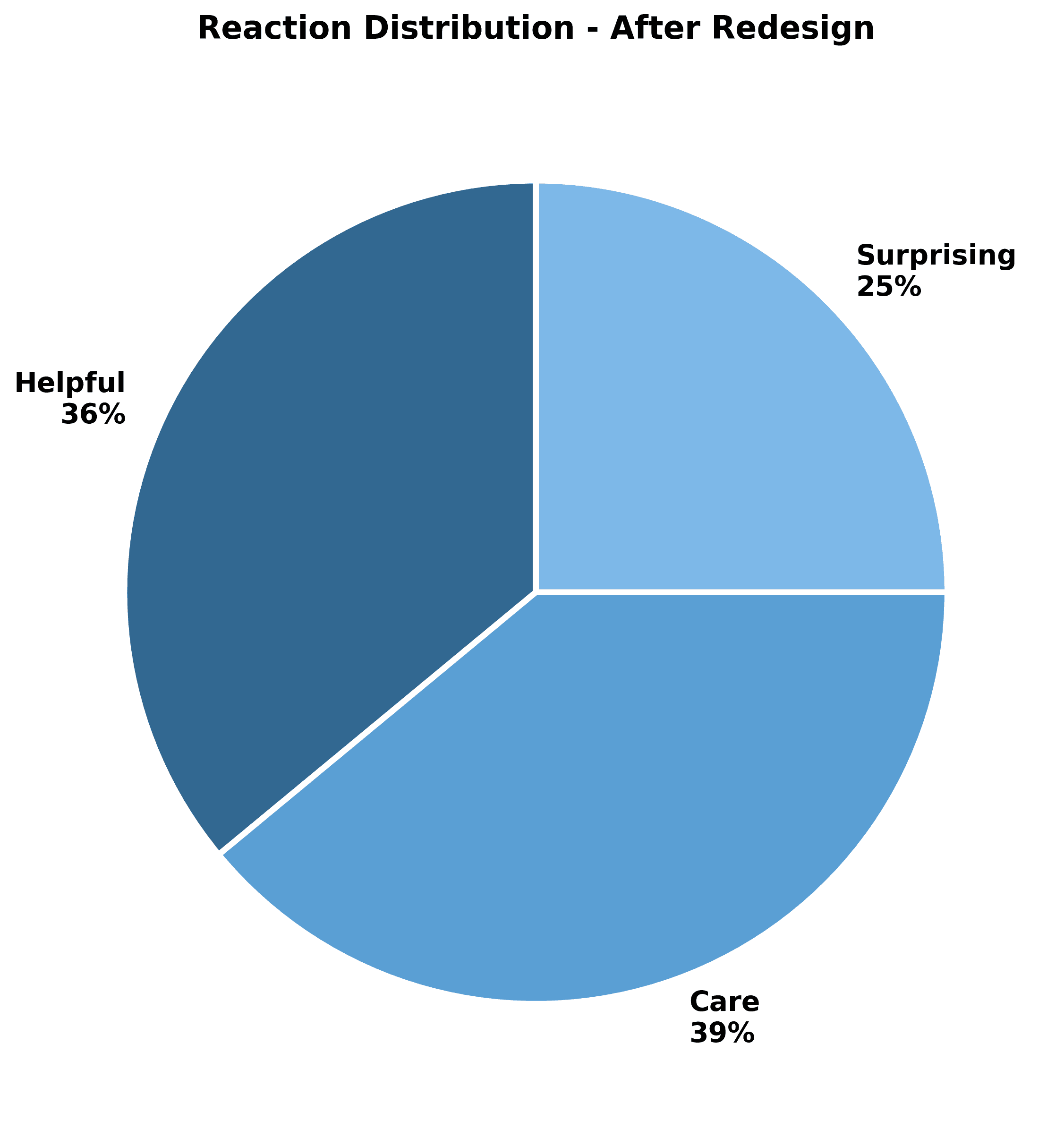
The Q4 2025 analysis showed marked improvements in user engagement with reactions and voting, demonstrating that more intuitive, visually engaging interaction design drives measurable behavior change.
Quantitative Impact
Increased reaction engagement
Improved comment quality metrics through sentiment ranking
Reduced moderation burden through better filtering
Qualitative Impact
Unified design direction across all conversation touchpoints
Stronger team alignment around product vision and strategy
Improved designer confidence through mentorship and clear guidance
Foundation for future conversation features built on consistent patterns
 |  |
 |  |
Discover more

